One of the biggest misconceptions in custom apparel printing is that every graphic file is ready for production.
At TPRNT, we process thousands of designs every month. While most files print beautifully, we regularly encounter artwork issues that can impact print quality, garment appearance, and customer satisfaction.
The good news is that most of these problems are easy to avoid once you know what to look for.
Here are six of the most common artwork mistakes we see and how you can avoid them.
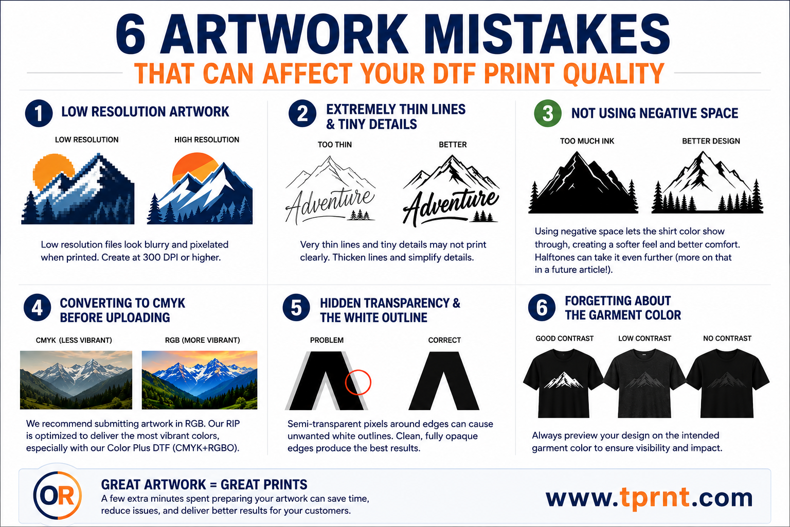
This is by far the most common issue we encounter.
A design may look sharp on a phone screen, social media post, or website, but when enlarged for printing, low-resolution artwork quickly becomes obvious.
Common symptoms include:
For best results, artwork should be created at its intended print size and at a minimum of 300 DPI.
If your design looks blurry when zoomed to 100% on your computer screen, it will likely look blurry when printed.
Pro Tips: Whenever possible, create logos and graphics as vector artwork. Vector files can be scaled to virtually any size without losing quality. Never use your phone to create artwork. Artwork designed on Canva or using AI is often low resolution.
DTF printing can reproduce incredible detail, but every printing process has practical limitations.
Designs that contain thin lines, tiny text, or small details may not reproduce exactly as expected.
Common examples include:
While these elements may look impressive when viewed on a large monitor, they can become difficult to see once transferred onto a garment.
Pro Tip: If a detail is difficult to see on your screen at actual print size, it may be difficult to see on the finished shirt as well.
One of the easiest ways to improve both the appearance and feel of a DTF print is by using negative space effectively.
Negative space refers to areas of the design where no ink is printed, allowing the garment itself to become part of the artwork.
Many designers create graphics with large solid areas of color because that's how the design appears on their computer screen. While these designs may look good visually, they often result in more ink coverage than necessary.
More ink coverage means:
By strategically incorporating negative space into a design, you can often achieve the same visual impact while significantly reducing the amount of ink being applied to the garment.
The first step is learning to use the shirt color as part of the artwork.
For example, if a design is being printed on a black shirt, many areas that would normally be printed black can simply be left transparent. The garment itself becomes part of the design.
This approach can create:
Once you become comfortable using shirt color as part of your design, the next step is learning how to use halftones to further reduce ink coverage while maintaining smooth gradients, shadows, and visual detail.
Halftones can dramatically improve the feel of larger prints while preserving the overall look of the artwork.
We'll dive deeper into halftone techniques, artwork preparation, and advanced negative space strategies in a future article.
Pro Tip: Before finalizing a design, ask yourself: "Does this area really need ink, or can the shirt color do the work for me?" The answer often leads to a softer, better-looking finished product.
This one surprises many people.
For years, designers were taught that everything destined for print should be converted to CMYK. While that may still apply to some traditional printing processes, we generally recommend submitting artwork in RGB color mode.
RGB contains a larger color gamut than CMYK and preserves more color information.
Our RIP software is specifically designed to process RGB artwork and convert it appropriately for production. In most cases, we achieve better results when customers leave artwork in RGB and allow our color management system to handle the conversion.
Benefits of submitting RGB artwork include:
This becomes even more important when using our Color Plus DTF process.
Unlike traditional DTF systems that use only CMYK inks, Color Plus DTF utilizes CMYK plus Red, Green, Blue, and Orange inks. This expanded color gamut allows us to reproduce many colors that standard CMYK systems struggle to achieve.
By keeping your artwork in RGB, our RIP has access to the maximum amount of color data available and can take full advantage of our expanded color capabilities.
Pro Tip: Unless your workflow specifically requires otherwise, create your artwork in RGB and let our RIP software handle the color conversion process.
This is one of the most overlooked issues in DTF artwork preparation.
Many graphics contain semi-transparent pixels around the edges of text, logos, and artwork. These pixels are often created during anti-aliasing, soft shadows, glow effects, image cutouts, or background removal.
On a computer screen, these semi-transparent pixels usually go unnoticed.
However, when printed as a DTF transfer, they can create what many decorators refer to as the "white outline" or "halo effect."
This occurs because partially transparent pixels may receive varying amounts of white ink underneath them. When applied to a garment, a faint white edge can become visible around text and graphics.
Common causes include:
Before uploading artwork, zoom in closely and inspect the edges of your design.
Pro Tip: Clean, fully opaque edges generally produce the sharpest and cleanest DTF transfers.
Many designs are created on a white artboard and never reviewed against the actual garment color.
This can create significant visibility issues.
Common examples include:
A design that looks fantastic on a white screen may look completely different when applied to a black, navy, charcoal, red, or royal blue shirt.
Sometimes a simple outline, stroke, shadow adjustment, or color change can dramatically improve the finished appearance.
Pro Tip: Always preview your artwork against the intended garment color before ordering transfers.
Great transfers start with great artwork.
Taking a few extra minutes to review your files before ordering can improve print quality, reduce production issues, and help ensure your customers receive the best possible finished product.
At TPRNT, we're always happy to review artwork and answer questions before production.
Our goal is simple: help you create better products, reduce headaches, and keep your customers coming back.
If you'd like us to review your artwork before placing an order, feel free to reach out. We're here to help.
Next Article: How to Build Gang Sheets That Save Time, Reduce Waste, and Increase Profit.
— Don Richner
Founder, TPRNT